Colour Trends for Summer 2013
based upon the IDEAS colour forecast spring/summer 2013 “JUMPING”
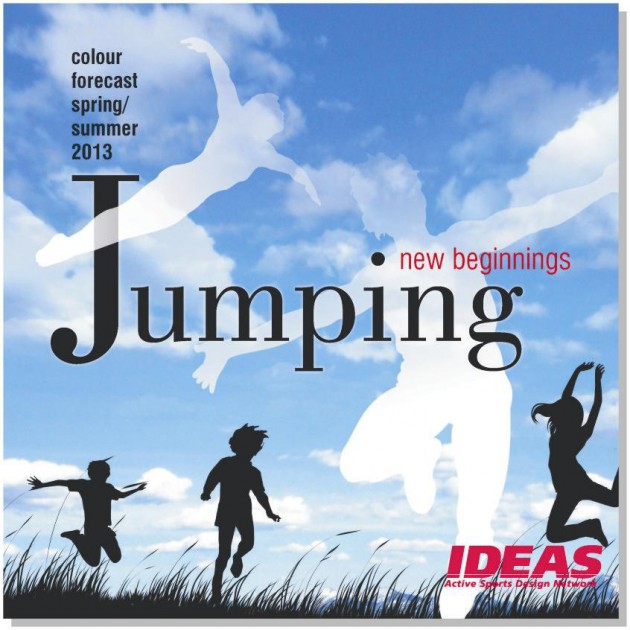
The headline of the IDEAS colour forecast plays with the idea of performing a jump – a jump into the unknown. Overcoming obstacles and gathering fresh hope.
New beginnings emerge out of this cheerful moment.
IDEAS has defined six different colour stories following the jump from the beginning to the landing:
at the edge, locomotion, go with the flow, transitory heights, touch down and ode to joy.
Please find a short description of each single colour theme below.
“at the edge“ is a homage to a lifestyle which we have to modify significantly in order to preserve the planet for the next generations. A close-up of a wonderful man-made world with fading brilliancy.
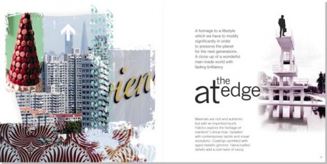
The colour palette shows both warmth and coolness – highlighted by an edgy fluo green. Intense red and light rose pair with sparkling champagne. Contrasted by bright aqua. Neutral tones and icy white set the background.
Some keywords concerning fabrics and the look:
- rich & authentic materials
- aged metallic glimmer
- peeling colours
- hand-crafted details
„locomotion“ pairs acceleration and vibrant spontanenity. Action and passion reflect the current urban spirit. Playfully criss-crossing back and forth, up and down.
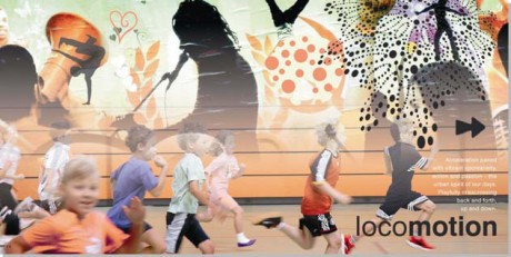
Retro colour harmonies with fresh and vibrant energy. Bright colours face softerchalky tones of mint green, apricot and taupe. A delicate and intense colour atmosphere.
Some keywords concerning the appeal of fabrics:
- focus on comfort & well-being
- synthetics with a matt cotton look
- a breeze of ´50s enchants active sports
- intensely coloured curvy patterns
„go with the flow“ – a sense of exploration and adventure. The swift wind of an energy shift. Resolutely forward driven.
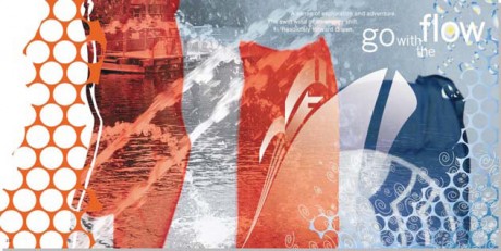
An array of colours deeply grounded in nature. Aquatic blues stand out against earthy browns and tomato red. Acid fluo yellow sets strong accents.
Keywords for the fabrics:
- fabric surfaces reflect the crystalline clarity of water
- fluidity with a technical spirit
- graphics inspired by geometric street art
“transitory heights” – every jump encloses the magic feeling of flying.
Temporarily airborne. Blurring lines. A hint of things to come.
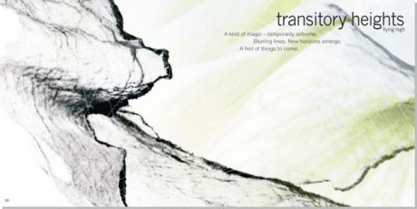
Black and radiant white predominate this pure and sober colour palette.
Ephemeral splashes of colour. Shades of red set intense accents. Cooled down by sky blue, petrol and fresh green.
Further keywords:
- fabrics get close to dematerialization
- ultra-lights with perfect functionality
- luminous play of colours, textures & transparencies
- fluid & sensual
„touch down“ – down to earth again. Reinforcing timelessness. Traditional craftsmanship experiences a renaissance in combination with contemporary technologies. A fascinating and inspiring tension between the old and the new.
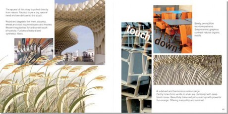
A subdued and harmonious colour range. Earthy tones from vanilla to khaki are combined with deep bluish tones. Beautifully balanced yet spiced up with powerful fluo-orange.
Some keywords concerning the look:
- fabrics with a dry, natural handle
- wood and vegetals like linen, wheat and sisal inspire textures & finishes
- fusion of natural and synthetic fibres
- craftmanship
„ode to joy“ – Successfully overcoming obstacles. Effervescent pride and joy. Delighting in the cheerful emotion of the moment.
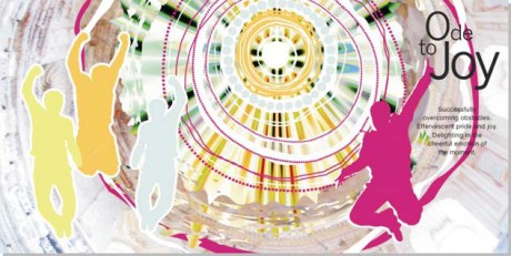
Broad daylight characterizes the vitality of the colour range. Intense colours like cheeky pink, brilliant orange and bright green are paired with luminous pastel shades.
Keywords for the mood:
- the charm of improvisation and fantasy
- fabrics with subtle washings
- glazed surfaces
- large-scale graphics
The complete IDEAS colour forecast summer 2013 (62 pages with graphic inspirations, recommendations for colour combinations) can be purchased exclusively by direct order via e-mail: news@ideas-designers.com.
Nora Kuehner
fashion design consulting