Colour Perspectives for Winter 2012/13 and Summer 2013
based upon the IDEAS colour forecast fall/winter 2012/13
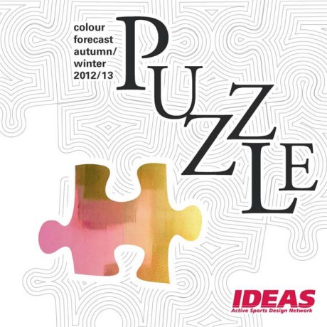
The IDEAS colour forecast fall/winter 2012/13 was inspired by the idea of the “PUZZLE”.
The capacity to decipher perplexing issues and to solve difficult problems is an essential survival skill and part of our daily lives. As we recognize that we have to rethink our lifestyles and break habits, this capacity is needed more than ever to path the way to the future.
Following the idea of a puzzle, IDEAS has defined six different colour stories for the winter season 2012/13:
swinging particles, criss-cross, strictly playful, beyond the obvious, re-arrange and joined together.
Please find a short description of each single colour theme on the following pages.
“swinging particles“ is a story about the body in motion – stretching beyond boundaries and floating freely. Colourful with blurred and hazy effects.
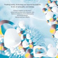
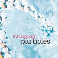
The colour palette is bright and breezy yet with a cool attitude. Shades of turquoise and pink set the tone. Icy grey and vibrant yellow illuminate the range. Dark navy and a delicate grey as background.
Some keywords concerning fabrics:
- fabrics with a delicate touch shiver softly
- high-performance suppleness
- discreet shine & crystalline effects
„criss-cross“ stands for a theme about the hybrid spirit of our time. A bold assemblage of nearly everything with a touch of nostalgia.
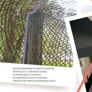
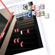
An array of creamy rather neutral colours. Edgy dashes of intense cobalt blue and coral red. A delicate colour atmosphere as framework for a highly individualized look.
Some keywords concerning the appeal of fabrics:
- fabrics with rustic and refined surfaces
- brushed and woollen aspects
- hand-made aspects for an individual look
- knit
„strictly playful“ – the joy of creation. Discover and develop with passion. Liberate your mind to innovate and proceed.
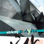
Eye-catching reds dominate a colour palette packed with energy.
Deep turquoise and soft lemon add vividness. Black shimmers like coal.
The metallic sparkle of silver sets dramatic accents.
Keywords for the fabrics:
- fabrics pair tactile sensations with cutting edge functionality
- multi-dimensional structures creating volume
- double-face fabrics with contrasting backside
“beyond the obvious” is a story inspired by human curiosity. We all like to know what is behind the next door, around the next curve.
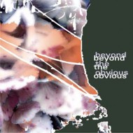
A cool winter day as inspiration for the colour range. Harmonious and sensual.
Light, tinted shades with some amazing accents. Brilliant white predominates the spirit of this colour palette.
An elaborated layering of fabrics and textures underlines this spirit.
Further keywords:
- light-weight fabrics create cosy volume
- subtle over-prints
- modest transparencies
- fluid & sensual
- fractured patterns enhance optical illusions
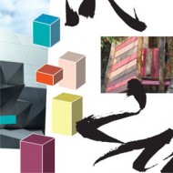
„re-arrange“ is a green story. Working on a new balance. Crafting the future with ingenuity and a deep concern for nature. Interlocking the needs of mankind and the resources of our planet.
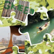
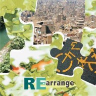
The rich colour palette evokes nature´s beauty and energy. Pure and intense.
Shades of vibrant green are highlighted by brilliant orange and radiant yellow.
Lucid aqua and precious gold set accents.
Some keywords concerning the look:
- material re-use for high-end fabrics
- traditional craftmanship meets latest technology
- textured surfaces imitate natural structures
- bark-like weaves
- coatings sprinkled with gold
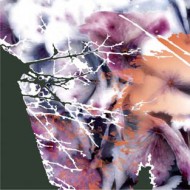
„joined together“ – the single pieces of the puzzle get linked and form a new masterpiece. The one and the many. An infinite potential for variation and interaction.

A vivid yet cool and clear colour palette. A predominance of bluish tones with glimpses of intense pink.
Keywords for the fabrics:
- stone meets steal – giving inspiration to fabrics & finishes
- polished and slightly frosted surfaces
- translucent effects
- multifaceted patterns
Looking forward to summer 2013 we see 4 strong colour themes:
“Energy Shift”: During the last months we have seen a lot of pictures loaded with energy and power – people fighting for their rights, natural disasters.
This energy is visualized for the upcoming season with brilliant yellow and red colour shades. Accents are set by intense green and blue.
“White Out”: Both the fight for rights and the natural disasters open up new chances. Like a blank sheet of white paper used for making plans and drafts for the future, we see a strong white colour story for summer 2013. Framed by intense black and with slight dashes of red and green. Giving just the idea of colour to this story.
Another important colour story arises out of the encounter of traditional craftsmanship and latest technologies. Wood of all kinds is actually the most wanted material both in architecture and interior design/ furniture. It istransformed in completely new shapes due to technical developments.We see a very natural colour story with different wooden colour shades. Accents come from light yellow, steel blue and intense red.
The last important inspiration develops out of the desire for clean air and pure water. “Follow the Flow” – a story with a predominance of bluish tones. Paired with earthy brown, violet blue and green.
The complete IDEAS colour forecast winter 2012/13 can be purchased exclusively by direct order via e-mail: news@ideas-designers.com.
Nora Kuehner
fashion design consulting