Allgemein
Diversity – the next challenge in sports
Diversity – the next challenge in sports
Lecture at OutDoor Show in Friedrichshafen (Germany) on July 12, 2014
Colour and trend perspectives spring/ summer 2016 for sports apparel
Colour and trend perspectives spring/ summer 2016 for sports apparel
Lecture at OutDoor Show in Friedrichshafen (Germany) on July 11, 2014
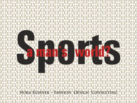
Sports – a Man´s World?
Quo vadis:
Sports – a man´s world?
Presentation at Performance Days Show
Munich/Germany, May 14, 2014
A glance at the sports industry and their products shows pictures of a man´s world. Rather homogenous collections follow more or less the ideal of high-performance challenges, loaded with sweat and adrenaline. Marketing campaigns delight in showing the extreme side of sports.
And of course most of these extreme activities take place outdoors – in wild and dangerous natural settings.
By following this idea of sports with its focus on functionality the sports apparel industry has reached a high level of perfection:
Fabric properties are ever improved and adapted to latest technological developments. The technical optimization of manufacturing is pushing the limits as well.
No wonder that sports apparel and accessories resemble an armor – the sports apparel industry concentrates on offering ever more protective and functional garments. And sad to say: They look all the same. No particular signature can be recognized. Only the logo allows the identification of the single brand.
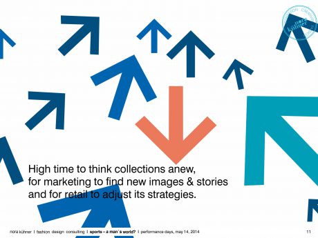
Therefore it is high time for the sports apparel industry to re-think the further development of sports clothing. At the core the development of sports garments has to consider functional, aesthetic & socio-cultural dimensions.
Sports have deeply changed within the last two decades. Once seen mainly as pure physical exercises, sports has turned into a matter of lifestyle. In ever more fragmented modern societies, individualization is growing. New target groups have been appearing on the scene but the sports industry still clings to the traditional ideas and images as guidelines for the development of their collections.
Therefore a lot of consumers in the classic industrialized countries feel neglected by the sports apparel industry: Women practising sports do not feel attracted by the results of this spirit – they do not like neither the advertising campaigns nor the products themselves.
It is high time both for the industry and the retailers to discover the chances of diversity!
More people than ever practice sports – and this does not mean high-performance sports. The number of high-performance sports people is rather small, the others – the majority – just enjoy movement and the feeling to do something good for themselves. And they expect the industry to support them in doing this.
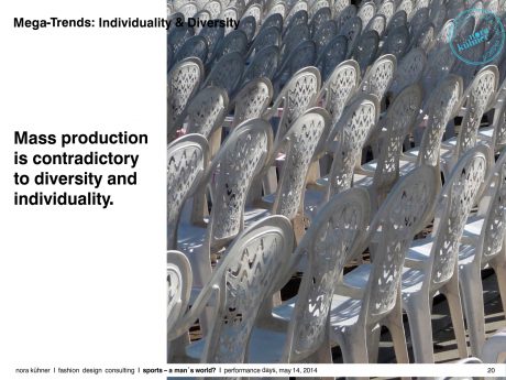
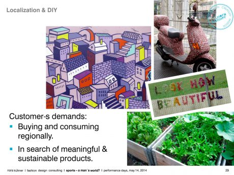
The current system of industrial production is not fitting the demands of modern societies – individualization, global mobility, localization and a growing ecological awareness have “produced” a multitude of fastidious, diverse & powerful consumers. And these consumers have grown up and ask the industry to feed their particular needs.
You want to know to know more? Please don´t hesitate to contact me!
Get your individually shaped interpretation and consulting in the field of sports apparel.
Munich, 26.05.2014
Nora Kuehner
fashion design consulting
Colour and trend perspectives 2016 for sports apparel
Nora Kuehner
fashion design consulting
Secretary General of IDEAS ACTIVE SPORTS DESIGN NETWORK
Presentation at Performance Days show in Munich/ Germany,
May 13, 2014
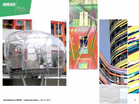
Colours & Trends
Update Winter 2015*16 and Preview Summer 2016
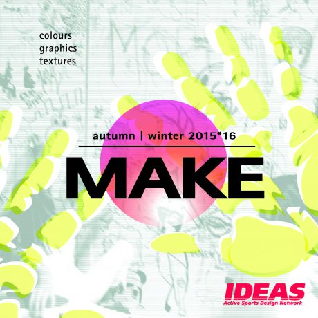
MAKE as the season´s keyword stands for the challenge to conquer new grounds, to ask new questions instead of answering to the existing ones and to appreciate diversity as a stimulating source of inspiration.
Moreover MAKE is the perfect guideline for developing amazing products with passion and know-how. The IDEAS colour stories for winter 2015*16 lend a fresh and powerful approach to the season.
Leave the beaten track and make your mark!
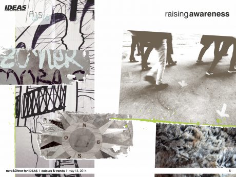
- momentum
A raising awareness for what mankind is about to lose – high time to turn concepts into reality. Heading off with powerful strides.
fabrics Discreet classics play with slight variations in texture and surface detail. Subdued jacquards. Double-faces with highly contrasting faces. Matte density and fluid sturdiness. Finely waxed surfaces.
graphics Subtle yet racy modulations of sober geometries. Fragments of architecture turn into decorative, abstract patterns. Brush-strokes. Scratchy hand-drawn lines.
colour mood A refined palette of earthy grey tones contrasted by bursts of toxic green and muted turquoise. A subdued but never austere colour range.
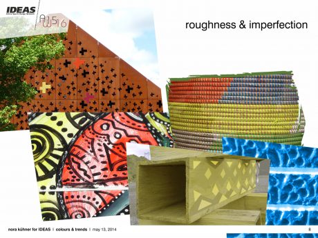
- Get raw!
Material fascination and a love for the hand-crafted. Re-awakening human senses in urban landscapes.
fabrics Careful material selection gains importance – raw and natural materiality is key to fabrics.
Haptic sensations. Rugged and expressive surfaces. Irregular blends of fibres. Double-brushed knits. Tufty fleeces. Fake fur. Hairy aspects for smooth softshells. Durable power stretch qualities with brushed backsides. Hand-crafted accessories.
graphics Organic motifs with corroded overprints. Winding lines and strict basket weaves. Tonal patterns inspired by stone walls. Precise laser-cut-outs add a sense of edginess to minimalistic geometry. Large-scale street-art scribbles. Scattered layers of mineral print motifs.
colour mood A colour palette in powerful harmony with a matte freshness. Warmed by shades of brick-red and spicy orange. Lush mossy green tones and dazzling blue underline the saturated vibrancy of this theme.
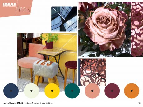
- Transformations
Signs of change – converting, completing, improving and beautifying the existing.
Interventions and transformations to adapt the existing to new concepts and individual needs.
fabrics Materials focus on fluidity and flexibility. Matte fabrics get in motion. Highly stretchy fabrics. Engineered long-lasting knits and wovens with fluffy volume. Enlarged yarn-dyed woollen checks. High performance finishes add traces of use to dense textures. Merino/silk blends offer a touch of luxury combined with high-performance properties.
graphics Pattern inspiration derives both from the past and the future. Using motifs from natural and industrial settings to create unique all-overs filled with light and shadow. Translucent effects lend motion to scattered geometries. Strange encounters of baroque flowers and rusty industrial relics.
colour mood The sophisticated palette is divided in warm and cool tones – slightly off-balanced.
Solid burgundy, rust orange and delicately tanned rose set the tone. Gloomy dark green and midnight blue add drama to the scenery. Lifted by injections of light misty green and soft mustard yellow.
- Let´s play!
Reset. Shifting moods. Emphasizing flexibility and openness. Finding innovative solutions through play.
fabrics Fabrics feature a dry and crispy hand-feel. Foamy thickness of blended synthetics. Milky laminations. Superlight technical jacquards. Small geometric all-over patterns adorn high-pile and woollen fleeces. Brushed backsides for thermal retention. Embossed textures both for knits and wovens.
graphics Rigid but simple geometric patterns create shapes and volume. Multi-faceted and angular architectural structures are broken by transparent and blurry inserts. Pixelated edges. Curvy lines add movement to distorted multi-coloured stripes. Bold monochrome lettering.
colour mood Bright colours bubbling with playfulness set up a positive mood. Colours hard to be ignored – hot pink and coral pair with eye-popping green and brilliant turquoise. Flashes of blackened midnight blue underline the vividness of this colour range.
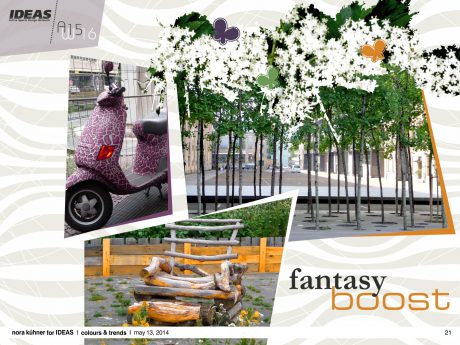
- fantasy boost
Celebrating creative deconstruction and limitless imagination. Manipulating the familiar, coming up with swirling amalgamations.
fabrics Fabrics experiment with complex and diverse structures, with natural fibres and eco-friendly synthetics. Developing a new visual approach to urban performance wear. Sculpting smooth curves with blends of wool and stretch. Playful melange look both for wovens and knits. Tactile double-faces. Matte coatings. Perforated finishes.
graphics Spontaneous and exuberant. A striking and sometimes surrealistic array of graphics – sharp geometric forms team with softly contoured botanical motifs. Photorealistic prints are embellished by hand-painted signs or placed splashes of colour. Slightly overloaded individual collages.
colour mood A moody mix of purple shades. Empowered by electric green and vibrant orange. Highlighted by light grey and frosted white. An energetic and vibrant mix reflecting perfectly the experimental mood of this theme.
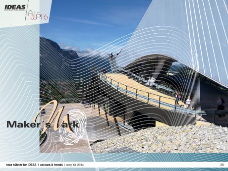
- Maker´s Mark
Off the beaten track – following the amazing flow of individuality.
fabrics Aiming to surprise – pushing the boundaries of performance fabrics. Offering highest comfort. Elaborated soft laminations. Ultrafine stretchy lightweights enhancing the freedom of movement. Porous coatings. Polished surfaces and metallic sheen.
graphics Humanizing digital drawing. The ever-fascinating beauty of hand-drawn scribbles. Allowing unexpected results. Lines in motion exploring the depth of space. Provoking surprises.
colour mood A relaxed and versatile theme vigorously on the move. The colour scheme focuses on shades of blue. Dark brown and creamy white set the framework. Cardinal red and shimmering copper evoke a precious appeal.
- Singularity
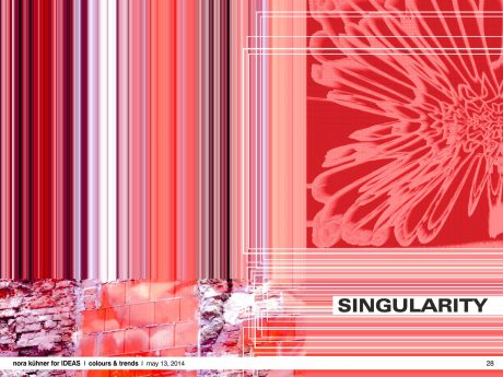
The beauty of new and unseen combinations. Exploring the unfinished to find individual niches. Delighting in reality, drawing inspiration from lucky accidents.
fabrics Material intensity. Highly elaborated fabrics. Small structures are elementary – light reflections bring dense fabrics to life. Soft and skin-caressing stretch materials. Rounded volumes. Velvety handle pairs with a precise metallic sheen.
graphics Breaking borders between genres. Random combinations of motifs and techniques. Expressive, generous all- over prints. Visible vibrations. Diffracted light and hazy looks. Impressionistic blurriness. Undulating lines blown away.
colour mood The range combines both colours of bright intensity and restrained neutrality. Thus creating an extremely vivid colour mood. Red, pink-as-can-be and striking purple dominate the scene. Shades of dark brown, olive wood and grey add shadowy accents. A breeze of mint lends freshness.
Please note:
The complete IDEAS colour forecast autumn I winter 2015*16 (64 pages with graphic inspirations & recommendations for colour combinations) can be purchased exclusively by direct order via e-mail: news@ideas-designers.com.
Looking beyond – Summer 2016
Inspired by the ever growing visual impact of any kind of food, IDEAS selected the word “FOOD” as creative guideline for the season spring/summer 2016. Furthermore food is vital for human beings.
Without food, no energy and no sports!
Food offers an overwhelming treasure of colours, flavours and textures. Transformed into inspirations for sports IDEAS defines two major directions: a wide array of red and pinkish tones as well as fresh blue and aqua tones. Both colour groups explore soft contrasts in depth. Slight powerful accents come from acid yellow and electric blue.
A beautifully balanced pastel colour range plays with light shades of the above mentioned red and blue colour groups.
Please note:
The complete IDEAS colour forecast for spring I summer 2016 will be available by July 10, 2014.
Munich, 26.05.2014
Nora Kuehner
for IDEAS Active Sports Design Network
Participation in the international trend board of Première Vision
Participation in the international trend board of Première Vision
for the season autumn/winter 2015/16 in Paris
Overdose! How much function does sports apparel really need?
Overdose! How much function does sports apparel really need?
Lecture at the Meisterschule for Mode in Munich (Germany) on February 11, 2014
Overdose! How much function in sports apparel?
Quo vadis:
Overdose! –
How much function does sports apparel need?
Presentation at Performance Days Show
Munich/Germany, November 21, 2013
Sports apparel has deeply changed within the last two decades. The image of sports today is stamped by challenging the limits and producing lots of adrenaline and thrill.
No wonder that sports apparel and accessories resemble an armor – the sports apparel industry concentrates on offering ever more protective and functional garments. The innovation of these garments derives mainly from material innovation and new technologies in manufacturing
But what about the design and the look? Pragmatic and functional with clean lines.
The optimization of fabrics and manufacturing seems to have created a new norm for sports clothing which follows rather the idea of designing by numbers than designing according to people´s needs and wishes. Emotion is out, numbers are in.
Of course there are the high-performers who are in search of the ultimate thrill and extreme experiences even at the risk of their own lives – but their number remains small. About 40% to 50% of the people in most of the classic industrialized countries perform sports regularly. A closer look to statistics shows that running, gymnastics, swimming and cycling are the preferred sports.
Therefore it is high time for the sports apparel industry to re-think the further development of sports clothing. At the core the development of sports garments has to consider functional, aesthetic & socio-cultural dimensions. Marketing, technology and design have to join forces to come up with contemporary and diverse clothing for societies which split up in more and more different tribes and communities.
A lot of consumers in the classic industrialized countries feel neglected by the sports apparel industry: Women miss a more fashionable approach and a good fit. The elder generations
still keep waiting for nice garments with a good cut. Urban commuters are in search for functional fashion which can easily be adapted to the needs of their individual way of life.
All these groups expect appropriate function in functional clothing, but they want added value – an appealing and fashionable look, a good fit, nice colours … and … and …
Do they ask too much?
Consumer behaviour is changing faster than ever – what about changes in the
sports apparel industry? There is a profound expertise in this industry for functional clothing – why not use this advantage to develop fashionable function – the new sportswear of the 21st century?
Let´s challenge the current notions of functionality & sports!
You want to know to know more? Please don´t hesitate to contact me!
Get your individually shaped interpretation and consulting in the field of sports apparel.
Nora Kuehner
fashion design consulting
Colour and trend perspectives 2015/16 for sports apparel
Nora Kuehner
fashion design consulting
Secretary General of IDEAS ACTIVE SPORTS DESIGN NETWORK
Presentation at Performance Days show in Munich/ Germany,
November 19, 2013
Colours & Trends
Update Summer 2015 and Preview Winter 2015*16
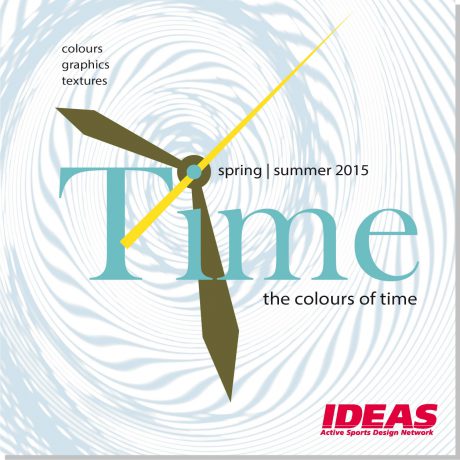
Life without clocks and agendas is hardly imaginable. Constant acceleration seems to go hand in hand with the development of modern societies. Yet does faster mean also better?
As usual IDEAS has set up six colour stories reflecting this rather sporting question in all its ambiguity.
- battling against the clock
Life on the fast track – caught in the trap of clocks, timetables and deadlines. Encased in omnipresent rigorous grids and structures.
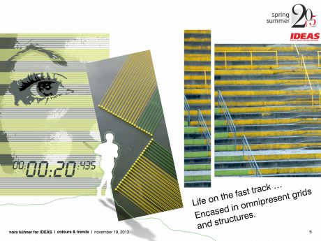
colour mood Vibrant and loaded with energy – sharp yellow and green beat the time of this colour range. Their splendour underlined by dark midnight blue. Combined with muted shades of cinnamon and olive grey. Speed up!
fabrics Perfect functionality & enhanced protection properties. Matte finishes preferred.
Double-weaves & ribstop. Knits made from blends of polyester or polyamide with natural fibres – stretch is added for highest comfort. Customized mesh patterns.
graphic inspiration Multiplying geometric motifs of all shapes and sizes to infinity. Precise stripes give structure to colour planes.
- action shots
Zooming in. Fragmented episodes of daily life – caught by everyone at any time and place.
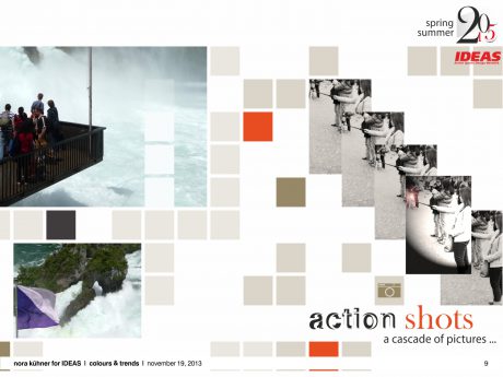
colour mood A subtle range of dense yet slightly hazy summer darks. Contrasted by bluish white.
Lush green adds a touch of nature while injections of orange red energize this delicate and vital colour palette.
fabrics Dense fluidity teamed with slight sturdiness. Engineered 3-layer laminates made from cotton/polyester blends. Foamy summer fleece. Merino blends. Subtly graduated yarn-dyed checks.
graphic inspiration Split-up motifs, individually re-composed. Traditional checks come to life by merging stripes and photographs.
- time out
The glaring intensity of sun-drenched landscapes and a cloudless sky. Moments of contemplation, calm and pureness.
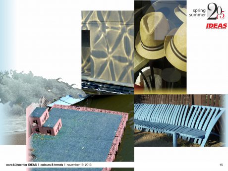
colour mood Softly fading colours with focus on a wide variety of blue and turquoise. Matched with deep earthy brown. Lifted by touches of light chalk pink and radiant yellow olive. Generating a nautical breeze both airy and relaxed.
fabrics A natural dry handle and perceptible structures are key to fabric surfaces. Puffy piqué and basket weaves.
graphic inspiration Inspiration derives from sealife. Mid-scale geometric patterns are easy-going rather than precise. Blurring edges with a soft glow. Scattered planes of colour create vivid abstract patterns. Playing with luminous lines.
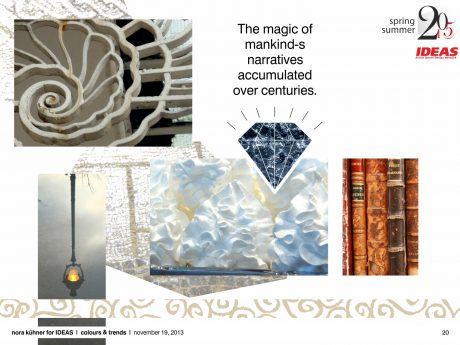
- precious mystery
Fascinated by the mysteries of ancient cultures. The magic of mankind´s narratives accumulated over centuries.
colour mood A colour range whose warm opulence just shows at second glance. Subtle tones of grey, sand, pale indigo and smoky fern pair with chalk white. Lifted with flashes of intensely bright violet and orange.
fabrics Juxtaposing the rough and luxury. A bite of shabbiness. Emphasising long durability. Subdued structures with a touch of extravagance. Raw finishes. Double jacquards and 3D knits.
graphic inspiration A rejection of homogenised design. Decorative patterns take inspiration from tapestries, mosaics, fossils and stone. Shapes inspired by nature are delicately fragmented.
- timeless
Slowing down – breaking the dictate of acceleration. Life follows the personal rhythm generating a lightness of being.
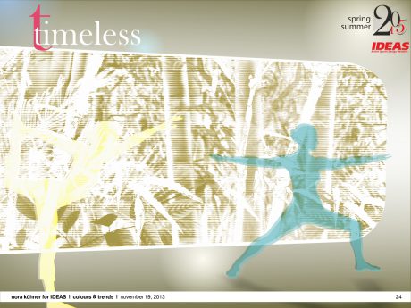
colour mood The colour palette is in perfect balance. Vibrant tones like buttercup yellow, coral red and jacaranda blue pair with pastel turquoise, creamy white and light khaki. Charcoal sets a strong graphic background accent. Timeless beauty at its best.
fabrics Fragile yet solid. Fabrics as natural as possible. Offering a wide variety of tactile sensory experiences. Smooth and fluid powerstretch qualities. Seersucker grades. A hint of colourised sheen.
graphic inspiration A bit of poetry in everyday life. Camouflage-like organic motifs in delicate colouring. Fantasy stripes. Hand-drawn lines follow the silhouettes of plants and flowers. Degradé effects enlighten colour planes.
- high time
Following the arrow of time … Moving forward … Time for real experimentalism. Developing new ideas and concepts for future living.
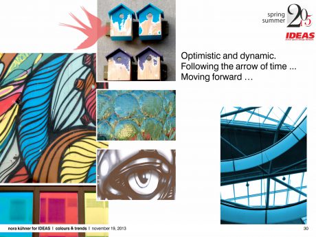
colour mood A vital colour scheme grabbing for attention. Optimistic and dynamic.Cool shades like brilliant aqua and deep sea blue are warmed up by salmon red and saturated burnt brown. Bleached yellow adds light and splendour while intense violet sets quirky accents.
fabrics Material exploration. Defying the confines of traditional industrial manufacturing methods. Transforming and combining are key to fabrics, structures and finishes. New essentials stamped by lightness and comfort for a nomadic society.
graphic inspiration Movement is everything. Leaving complexity behind. Placed colour splashes. The interaction of angular background grids and freely meandering lines creates new spaces and shapes. Geometry in motion. Slightly coloured transparent overprints.
Please note:
The complete IDEAS colour forecast spring I summer 2015 (64 pages with graphic inspirations & recommendations for colour combinations) can be purchased exclusively by direct order via e-mail: news@ideas-designers.com.
Looking beyond – Winter 2015*16
The season is marked by the wish to preserve diversity by thinking beyond mass-production.
People share the desire for singularity – reviving traditional crafts and techniques. Make the difference!
Colours pay tribute to this desire – colouring the season with a very emotionally-loaded vitality.
The major focus is on earthy red tones with all their optimistic and powerful splendour. Paired with cool and fresh shades of blue and green. Cosy and sometimes pearly neutrals underline the delicate and lively mood.
Please note:
The complete IDEAS colour forecast for autumn/winter 2015*16 will be available by
January 26, 2014.
Nora Kuehner
for IDEAS Active Sports Design Network
More or Less? How much function does sports apparel really need?
More or Less? How much function does sports apparel really need?
Lecture for the DTB (Dialog Textil-Bekleidung), Study Group Functional Textiles, in Hohenstein (Germany) on Oktober 29, 2013
Participation in the international trend board of Première Vision
Participation in the international trend board of Première Vision
for the season spring/ summer 2015 in Paris